When it came to producing my music video
and ancillary text, I aimed to show continuity throughout each text to create
cohesion. As mentioned in the brief this is a promotional package therefore
each text had to compliment each other. During my research I found that
continuity was a key convention between media texts promoting a particular
artist. Between all three of my media texts the main aspect that brings them
together is the use of the rose petals and the color scheme.
After looking at all my three of my
products together, I feel that even though they all follow key conventions and effectively
work well together I think there could be improvements made. For example even
though there is a specific ideology behind not showing the image of the artist
on the album front cover and poster, I feel that I should of possibly used an
image of the artist on the poster to further enhance the cohesion between all
three products. If I was to design my poster again I would possibly use an
image of my artist taken from my music video and kept the image overlap of the
roses to keep the idea of continuity and cohesion.
Overall
I believe I have promoted all three of my media products effectively through
combing them all together through various aspects. When all three products are
placed together you can see that they are all related texts through the use of
imagery, colours and font. When it came to my ancillary texts I used the same
aspects within my video, as it resembles that all the products are linked
together and are promoting the same artist. It would be unconventional to apply
a whole different aspect and theme to the ancillary texts then the video.
I wanted all my products to show continuity and combine well together, however I also wanted my work to be remember-able and unusual, therefore in the ancillary texts I have not used images of the protagonist Dan but have made a concious decision to use images from the video and props from the video as the main images on my ancillary texts, but because these images have featured in the video it shows continuity and that they all combine well together.
I wanted all my products to show continuity and combine well together, however I also wanted my work to be remember-able and unusual, therefore in the ancillary texts I have not used images of the protagonist Dan but have made a concious decision to use images from the video and props from the video as the main images on my ancillary texts, but because these images have featured in the video it shows continuity and that they all combine well together.

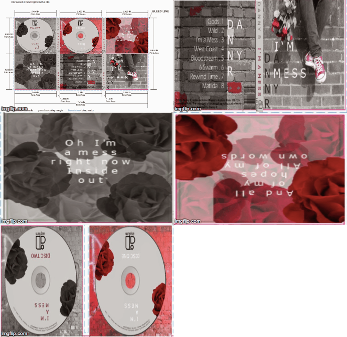
My initial thoughts for my digipak were to
have the themes love and emotion, as I wanted the main focus to be on the roses
as they are a main symbol used to represent love and is a key prop used in my
music video. I wanted my colours to be quite dense and use black and white, as
I didn’t want them to be too bright and vibrant, as it would take away the
whole aesthetic of the products. To get these images of the roses I had to buy
a bunch of flowers and then pull off a single rose and then separate the petals
so the flower looked more open and easy to recognize as a rose flower. I used
my own iPhone to take these images at home. I chose to use the colours red,
black and white as my three main colours as the red represents passion and
love, black can have negative connotations like death whereas white connotes
purity and innocence which all relate to my underlying message of love. Above is a gif I have created to show each aspect of my digipak and how I have
From my research I found that the majority
of existing ancillary texts use images from the actual music video as the main
focus or style. As shown above I have given an example of how Rihanna has done
this from her video ‘The only girl in the world’ they have taken the idea of
the close ups used and the style from the video then applied it to the album
digipak, this shows how products combine well together to be effective. I have
also followed this convention as shown above, how I have used the brick wall
concept in the video and then used it on my album front and back cover, this
shows continuity and flow between my products.
By doing this it helps if someone was to watch
the music video but not remember the name of the artist or song, but could
visually recognize a aspect of the video, for example the actress/actor,
location and setting which is then used on a Digipak or poster. This again
helps the products become effective as a combination of texts together in the
promotion of the singer.
Looking back at the pre-production and the
images I had taken for my ancillary texts, I had made sure my actor Dan wore
the same outfit, and obviously didn’t need any make-up. By doing this it
creating continuity throughout all three products I had created.


No comments:
Post a Comment